
As photographers, whether beginner or professional, saturation and vibrance is basic adjustment we all use in our post production workflow.
Many of us are familiar with the different effects of saturation vs vibrance, but have you ever really thought about what makes them different?
It doesn’t matter if you use photoshop or lightroom, the principles of saturation and vibrance still apply. There is a subtle, but important difference between these two important photo editing settings.
Saturation Compared to Vibrance in Lightroom
How they differ: The vibrance changes the colors in your photos that are not very vibrant in the first place. In any image, depending on the shot and the lighting, you may have some colors that “pop” while other colors are more muted.
- Saturation: Changing saturation changes the intensity or dullness of all colors in your image.
- Vibrance: Changing vibrance changes the intensity or dullness of certain colors in your image.
When you change the vibrance setting in Lightroom or Photoshop, for instance, it will only change the colors that are more muted, and it will leave the colors that already “pop,” alone.
In technical terms, vibrance changes only the midtones, while saturation changes all colors. When you change Saturation, it doesn’t discriminate against any color; it will intensify or dull all colors.
Saturation and Vibrance are all about color
Color is one of the most important parts in crafting an amazing photo. It’s also one of the most difficult to get right. For example:
- Too much color: Too much editing can risk in the picture being seen as a photoshopped or “fake” picture.
- Too little color: Not enough color can result in the picture looking dull. Especially when shooting raw (and the colors are underwhelming)
Finding the right balance is incredibly important and the use of Vibrance Vs. Saturation (or clarity) is integral to get that perfect balance of color in your photographs. We’ll be taking a look at the basics on using these three in Lightroom.
Adjusting Saturation Vs. Vibrance in Lightroom
Clarity, Vibrance, and Saturation can be found under the Develop tab, under Presence in the Basics area:
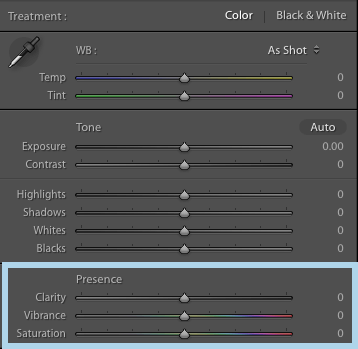
All three are ranged options, from -100 to 100.
Dragging it to the left will decrease the intensity and dragging it to right increases the intensity. Each of the three plays a different role in making that perfect blend of color. While all three are easy to be familiarized with, it’s best to understand them so we’ll be looking at the principle and use of each one.
Adjusting Saturation in Lightroom
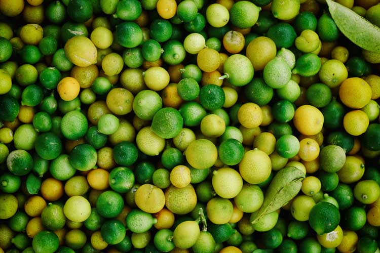
Saturation is very similar to Vibrance. As the name says, Saturation plays with the intensity of saturation of colors. While Vibrance plays with the colors in the midtones, the effect of altering Saturation is spread all throughout the tone curve, from shadows to highlights.
This means that dragging Saturation all the way to the right will completely saturate all the colors in the picture. Dragging it all the way to the left will render the image in grayscale.
Sample image with Saturation on +100
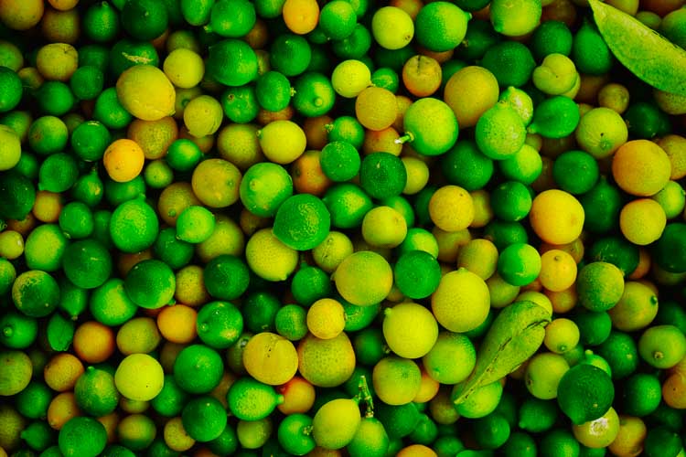
Sample image with Saturation on -100

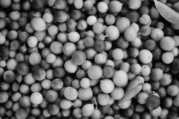
Because altering Saturation affects all colors in the tone curve, it is the trickiest to use out of the three.
- Too much Saturation: might make your image look too edited and fake.
- Too little Saturation: might make it dull and unappealing unless you’re editing in a style that compliments desaturated photos (which some styles of photo editing do call for de-saturation).
In general, Saturation is best used in small doses, otherwise, you risk going too high or too low.
Adjusting Vibrance in Lightroom
Vibrance plays a more hands-on role in altering color in a shot than, say Clarity. Vibrance confuses many beginner photographers, which is completely natural. Just as Clarity and Contrast can get mixed up, Vibrance and Saturation are commonly mixed up as well.
Both Vibrance and Saturation play similar roles of increasing the intensity of the colors in the shot. So yes, although they are different tools, both focus primarily on the saturation of the colors in the picture.
The difference is that Vibrance, like Clarity, only alters the colors in the midtones of the picture.
Again, the use of Vibrance is simple. Dragging the Lightroom slider to the right, to 100, saturates the midtone colors. Dragging it to the left desaturates them.
Sample image with Vibrance on +100

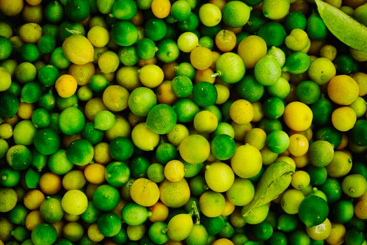
Sample image with Vibrance on -100


Vibrance can be very effective if you want to make certain colors of your picture pop up more while still keeping the whole shot generally flat.
You can see how Vibrance only affects the colors in the midtones because even when it’s maxed out at -100, the picture isn’t completely desaturated. When you zoom in, you can still see a hint of color from the shadows and highlights. It’s not completely grayed out.
If you compare this low vibrance photo to the above low saturation photo, you will see the difference. The low vibrance photo still keeps some of the color, whereas the desaturated photo does not contain any color.
Adjusting Clarity in Lightroom
Clarity plays an indirect part in the intensity of color. There can be confusion regarding the difference between Clarity and Contrast. And in fact, strictly speaking of color changes, there is not a lot to differentiate the two. Both of them have similar uses.
Clarity and Contrast both focus on how sharp or how dull the color pops up. Contrast simply increases or decreases the intensity of how all colors pop up (from shadows to highlights).
Clarity, on the other hand, only alters how much the colors in the midtones pop up. It’s simple once you get the hang of it.
Increasing clarity will make the colors appear sharper. Decreasing clarity will dull the colors and make it look a bit blurred. Dragging it all the way to the left gives off that blurred and hazy look.
Increasing clarity can enhance shots that are a bit off-focused and shots with the aperture setting set on too low. Clarity usually works best when used subtly, but it will depend on the type of shot you will be editing.
Sample image with Clarity on +100


Sample image with Clarity on -100

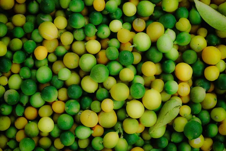
- High clarity uses: When you want a grungy or HDR effect, clarity can really shine. However, you only want to increase clarity to a noticeable extent if you want that look. Otherwise, it may look out of place on an image.
- Low clarity uses: The same goes for low clarity image edits. You want to make sure you only use low clarity on images that you want the look of a smoothed out, soft look. Common uses of lower clarity might be of portrait shots of women or kids. However, you still need to be careful not to lower the clarity too much, or the photo will look unnatural.
Final Saturation Vs Vibrance Tips
The blending of Vibrance Vs Saturation and Clarity can make or break a wonderful shot. In general, a perfect blend can make the picture look stunning without even trying.
Another tip you can use for a lot of pictures is to make a Lightroom preset that bumps up Clarity a little, increases Vibrance by a bit more, and slightly decreases the Saturation.
You can apply a preset like this to an album of your shots, and then manually adjust each one to perfection. Doing this simple trick sharpens and pops up the color in a balanced way. A big increase in Vibrance is offset by the little decrease in Saturation, making the popping up of the colors a bit more subtle.
Clarity, Vibrance, and Saturation are easy to use once you understand the principle behind them. Just remember that with these three, subtlety is key.

Leave a Reply